Vela Wine Bar
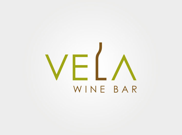
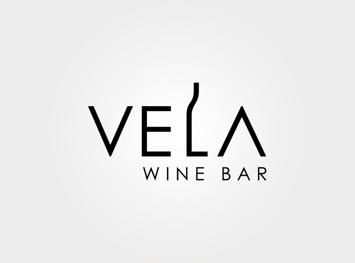
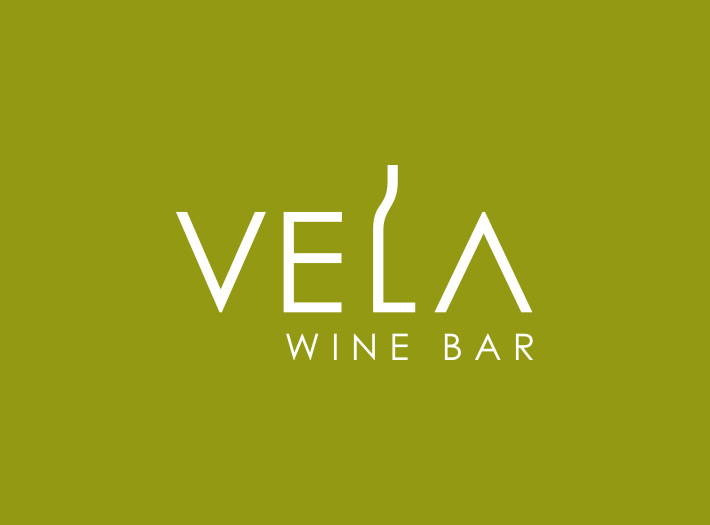
Vela Wine Bar needed a logo that was modern with a west coast vibe but simple enough to be used on a variety of applications. I chose to explore a variety of simple, but effective type treatments to achieve the result our client sought.
For starters, selecting a simple, clean sans-serif typeface sets the tone for the “modern” stage, but I felt removing the bar from the “A” (to mimic the shape of the “V”) added an element of surprise and uniqueness to the type as a unit.
Of course, the real trick here is the modification of the “L” to form the silhouette / shape of a wine bottle. The solution is simple with a twist. Finally, came color experimentation. I explored a variety of color palettes, but in the end the client was partial to a more “earthy” color combination that I think adds a sense of maturity to the overall design.