Naturally Nourished
Naturally Nourished offers health coaching for people looking to improve their lives through better nutrition, weight loss and exercise. The idea is to work closely with people to help them achieve their goals in a more holistic and emotionally supportive way.
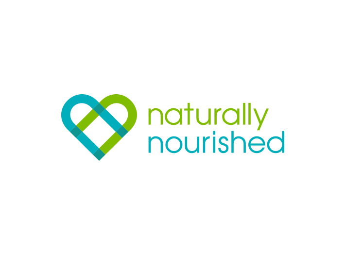
I was charged with redesigning their logo. Their old logo consisted of a red heart / apple doodle. While the client was open to any direction, I was told they still wanted to explore the symbol of a heart. Other directives included steering away from the color red and instead selecting a color palette appealing to both men and women.
After some sketching, I found a way to make the classic heart shape more relative to this particular client. By extending the outline of the two curved portions of the heart, I could create two overlapping “N’s” relating to the two used in the name. I innately felt the overlapping transparent qualities of this logo, as well as the blue and green palette created a modern, organic design hinting at the unity of various pieces of a larger whole.
In other words, this design exemplified the methodology of meeting a challenge and working to solve it from various avenues, a methodology inherent to this client. Coupled with a simple sans serif typeface, the end result is a more unique, relative and smart use of a heart symbol.