Koontz McCombs

Koontz McCombs was a company in desperate need of new collateral pieces to showcase their array of capabilities and portfolio to potential clients. Their old brochures were outdated and poorly designed. I was given the opportunity to elevate their collateral to ultimately convey experience, expertise and vision. Qualities that were hard-earned and now well protected within the culture of Koontz McCombs.
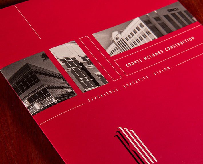
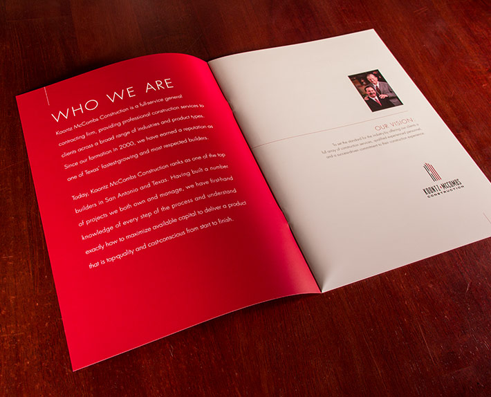
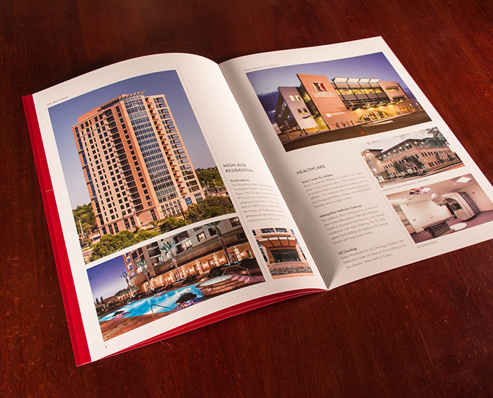
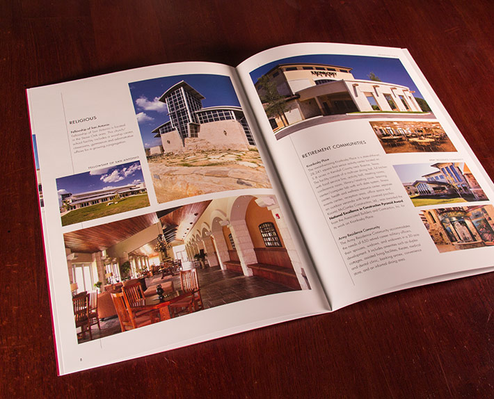
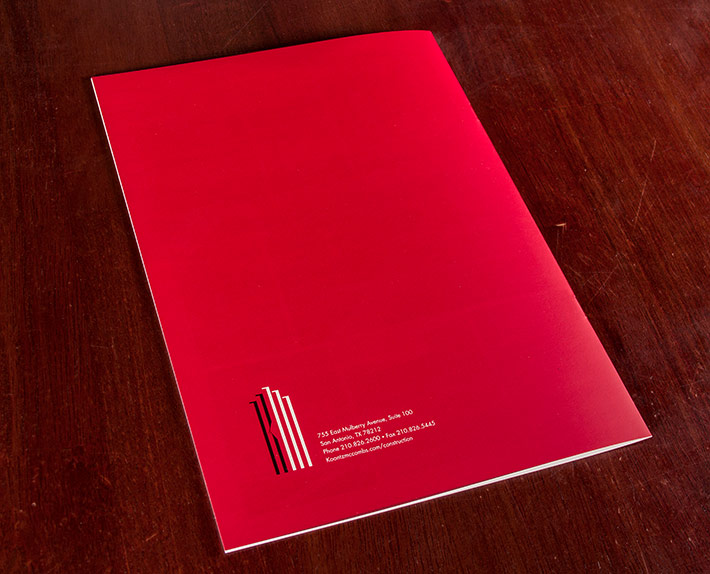
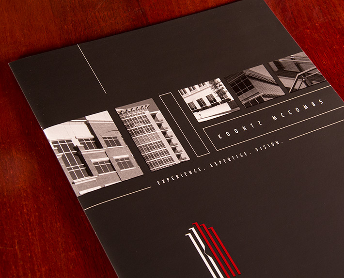
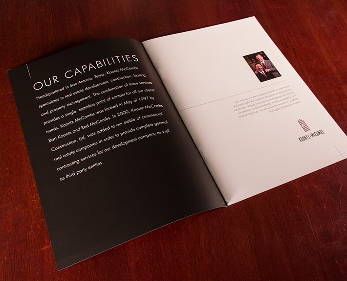
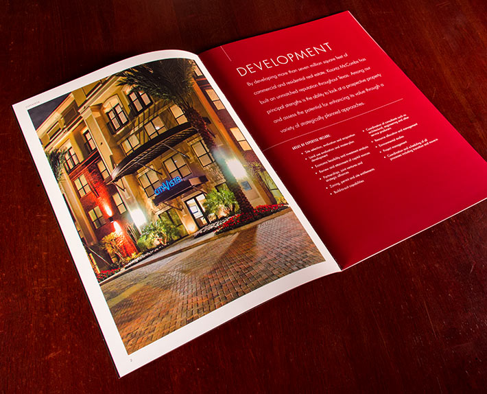
Their company colors became immediate differentiators between the two brochures. The red cover denotes their “Construction Brochure” while the black cover denotes their “Corporate Brochure”. I wanted the design to be simple and clean allowing the photography to take center stage. Color fields are sprinkled throughout the pages to offer a respite while also providing valuable information about the company.
Rule lines are used throughout the design to help the reader’s eyes navigate the pages. They also add a subtle hint at precision and construction. To create an immediate tactile experience, the covers on both brochures are hit with a special soft-touch aqueous coating that feels wonderful in your hands. Lastly, the logo and grayscale images on both covers are hit with an inline raised gloss UV coating which pops nicely off the duller soft touch application.